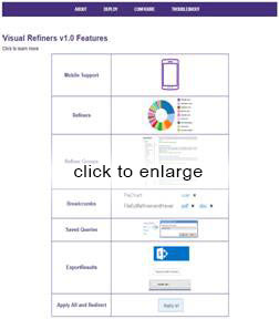
Today BA Insight announced a new version of our Visual Refiners application (you can read the announcement here. The focus of this release is bringing mobile search to Office 365 – so in addition to the core features of Visual Refiners, we’ve added support for:
- Office 365: Visual Refiners is now available as a SharePoint-hosted add-in, which means it deploys easily in O365 tenants without the need for additional infrastructure.
- Mobile devices: in addition to being reactive, we have made visual refiners modal – which means that the refinement panel becomes full screen on a mobile device, and controls switch to designed-for-mobile styles for ease of use with limited screen real estate.
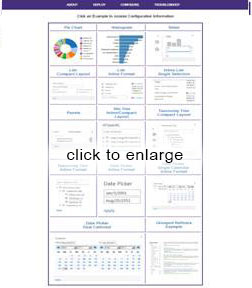
Visual Refiners provides controls for drill down and refinement with many different presentation elements including tree refiners, pie charts, histograms and dashboard layout. It also includes a number of other features and controls; you can get an overview of its features and benefits on our web site.
It’s all about the user experience
Don’t you wish you could provide the same user experience to your users that sites like Amazon and Expedia provide? The capability to browse content by filtering on refiners is key in helping them have a superior experience. And the user experience – always an essential ingredient in the success of search and search-driven applications – is more and more central as user’s expectations rise, informed by better and better experiences with consumer sites.
The problem in our industry is that few internally facing sites get this right. It’s much harder than it looks.
Why is it hard to make search easy?
There’s a maxim in the user interface and user experience (UI/UX) design community that the simpler and easier a UX is to use, the harder it is to build. That is very true for search. The expectation is that search will have a very simple, easy-to-use interface with no training required, despite some very daunting factors:
- a very wide range of different information goals, with a highly subjective judgement of “the right answer”
- a completely data-driven experience with almost no fixed elements
- a very complicated set of technologies under the hood
Faceted search – some background
Faceted search (also called faceted navigation and refinement) is so familiar and universal today that you may be surprised that it was revolutionary when it was invented. About 15 years ago, a research project at UC Berkeley under Professor Marti Hearst came up with it under the name FLAMENCO (which stands for FLexible information Access using MEtadata in Novel Combinations).
The faceted search approach caught on quickly. From its origin as an academic prototype in 2003 it quickly became a feature of high-end e-Commerce sites such as Amazon.com. By 2007 it was a standard feature of online shopping sites, and it started showing up in sites behind the firewall too. By 2009, when Microsoft introduced refiners in SharePoint search, and Daniel Tunkelang’s “Faceted Search” book was published, facets were a proven way to make search work. Every book on UX design now includes this pattern.
Most search UX is still done poorly
But today, in 2017, though faceted search is ubiquitous, it is still rarely deployed effectively for employee facing search. Why?
- Lack of Metadata – for facets to work there must be metadata. For online shopping, this metadata is supplied in spades; every attribute is populated because this is a priority for product information (and easy to get). For most employee-facing portals such as intranets and knowledge centers, metadata is missing or poor quality. (That’s why we made our AutoClassifier – to create consistent, high quality metadata by machine).
- Lowest-denominator controls – the most popular search products include facets that are designed to do something for every deployment, but they are weak. This was true for the Google Search Appliance, and it is particularly true for SharePoint Search. The out-of-the-box SharePoint refiners are set up for deployments that have only a few metadata attributes and not that many values of each. They do poorly in metadata-rich situations – where faceted search really thrives. They also are missing elements that come up regularly in search UX – like saved searches, or backing out of one facet while keeping others.
- Limited awareness of search-driven UX – a natural approach when the out-of-the-box controls are insufficient is to write some custom code. SharePoint has a well-documented search API and the display templates are made to be customized. For branding this is fabulous. But in addition to the usual downsides of custom code (maintenance cost, upgrade burden, etc.), I’ve found that very few developers get the nuances of search UX.
For example- say you want a control to export results, so you write a web part that gets the full search results and dumps it out. But it’s actually hard to get the full set – search engines limit result sets to a page and get much slower as the page size is bigger, so there is a maximum page size. And the count you get in the search result is not accurate and might change between pages.
Another example- your refiner is hierarchical, so you create a tree control. But you discover that SharePoint sometimes gives you the full path and sometimes it doesn’t. You find that some people want to match on interior nodes. And when you do a multiselect on the hierarchy, weird things start to happen.
I could go on and on. I have seen many examples of these kind of controls failing, even though they are built by competent and well-intentioned developers. It’s sad to see people re-invent the wheel and then not have it even work.
That’s what motivated us to build Visual Refiners in the first place. These patterns come up over and over in search, and they are best done as product-quality code that’s professionally maintained.
Mobile adds a new dimension
The mobile environment is growing and everybody is trying to improve the elements that are present in apps and create the mobile user experience. When going from desktop to mobile design, you quickly realize that things are completely different. A small screen limits how much you can see and control, and users are often working with one thumb and one eyeball.
For Visual Refiners, that means making refiner controls go full-screen on mobile devices and providing mobile-friendly controls. We’ve also found that many mobile implementations are custom (in part because SharePoint has been very slow to accommodate mobile well). Therefore, we’ve tried to make sure that every element can be controlled via CSS, while still guarding people from doing things that don’t work well in search.
Making a great search UX is hard, and doubly so on mobile. The limited awareness of search-driven UX I mentioned above also has bigger impact. I reviewed a mobile search design for one of our customers, done by one of the premier design firms in the country (who shall remain nameless). Their design involved going through refinement dimensions a few at a time on different screens, in a fixed order, and then showing results. This is a non-starter for search. Depending on the data and query, different dimensions may or may be relevant or available. It is also easy to end up with no results, unless you provide immediate feedback about how many results you’ll get from a choice of refiner values. We were able to apply Visual Refiners and use the design firm’s look and feel, resulting in a great mobile experience. But I had to argue and explain these elements many times to the UX designers (who were very experienced) before things clicked.
Other notable updates in Visual Refiners
In addition to mobile support and Office 365 support, there are several other notable features in the new Visual Refiners release.
- Apply redirect: allows you to reroute the current query to another results page, based on the refiners. For example, if a user selected product attributes, then they can be brought directly to a search vertical focused only on product information.
- Apply All: lets you apply all of the selected values from multiple multi-select refiners at once.
- Saved Queries: includes a regular expression filter on query history, swipe left/swipe right controls, and a responsive edit dialog.
- Global Settings: allows configuration through a separate add-in on o365.
- Performance: has been further optimized in several areas, most notably on hover panels
- Documentation: online guides with easy navigation and search (example screenshots below — click to enlarge)
Visual Refiners has a bright future. There is still active research around mobile search user experiences, both in academia and in the industry. New design patterns are showing up in consumer mobile search, along with new UI styles. We’ll work to bring the best to our customers.
We are always interested in new ideas and difficult challenges, so if you have questions or suggestions around Visual Refiners and how to make a great search UX, don’t hesitate to contact us.
Frequently Asked Questions:
Have you added support for SharePoint 2016?
Yes, Visual Refiners now supports O365, SharePoint 2013 and SharePoint 2016. There are two different packages – one for SharePoint 2013/2016 and one for Office 365.
How do I know what kind of visualization to use for each refiner?
For the most part, this is self-evident based on the type of data in the refiner. For example, if you have site URLs, use the site tree layouts; if you have dates, use one of the calendars or date pickers; if your refiner is hierarchical, use one of the taxonomy tree layouts.
Choice of the compact vs inline formats and use of refiner groups depends on several factors, most notably the number of refiners you have in the data.
Choice of different charting controls and list formats depends on how many different values you have for a given refiner. Beyond this there is also a question of your site aesthetics and preferences.
Ultimately, the goal is usability, so we recommend trying a configuration with some end users before deploying to production. It is easy to change visualization formats with visual refiners, so you can try some variations very quickly.
When I save searches, does it include the refiner values?
Yes, the saved query by default includes the selected refiners, so the user doesn’t need to repeat the filtering process. Users can also save searches and exclude refinement filters.
Do you support mobile with your previews too?
Yes, we have added mobile support to our Smart Preview product as well. Previews now go full screen on small screen devices and have other mobile-friendly features. Customers used to out-of-the-box previews will enjoy the responsiveness and bandwidth reduction of Smart Previews, because we generate previews ahead of time and only transmit the most relevant page.
Do you supply a mobile-friendly search results layout?
No, BA Insight does not supply results templates specifically optimized for mobile devices, nor do we supply a mobile-specific ranking profile. We recommend including both in a mobile search application. If your organization needs help with these, contact BA Insight professional services.


